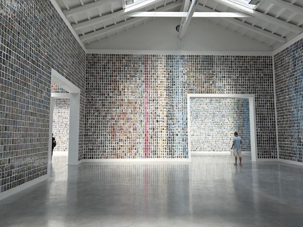
With Los restos, Oriol Vilanova fills the Spanish Pavilion with forgotten postcards: an immersive experience that questions our habit of looking at, choosing, and preserving images over time.
Thousands of postcards cover the walls of the Spanish pavilion, from floor to ceiling. Fifty thousand of them, they say at the entrance.
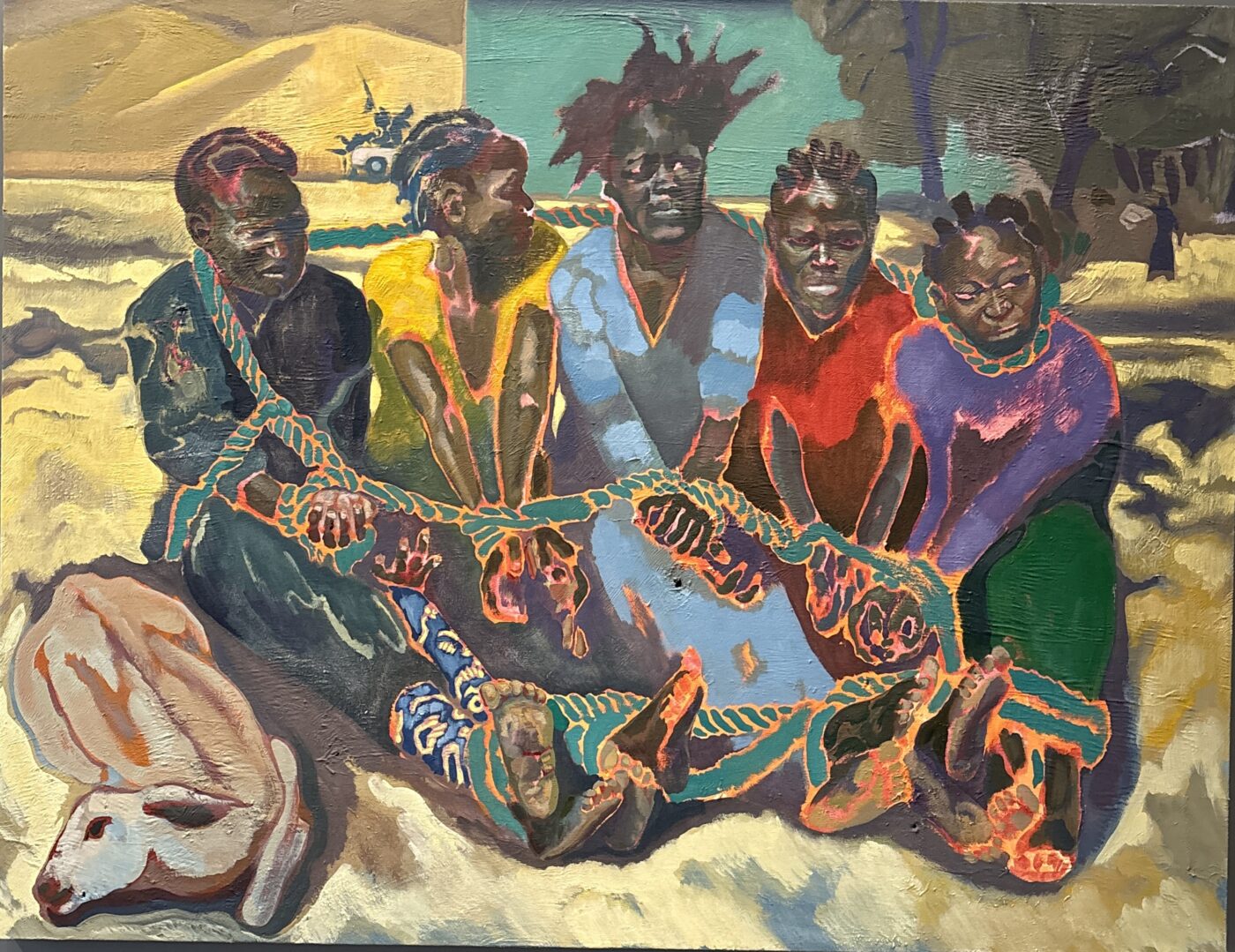
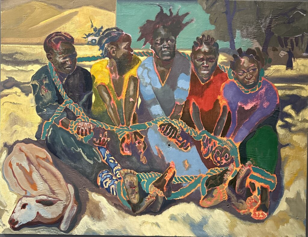
There is an exhibition at Palazzo Grassi dedicated to Michael Armitage, born in Nairobi to a Kenyan mother and an English father, raised in Africa and, from adolescence, in London, where he trained at the Royal Academy. His works tell the story of contemporary Kenya.
I arrive at the exhibition as though carrying a promise in my pocket — but it is a promise the first rooms both keep and betray at once. The canvases are large, the colours warm and beguiling; the narratives often cruel.
In the room overlooking the Canal Grande, the brightest of all, I stop between two windows before a work smaller than the rest: a circular, hypnotic movement of concentric circles lifts a mother and child in a celestial spiral. It might be a secular Assumption, were it not for a distant figure in the background — like a saint who has lost his balance and is being carried off by the wind.
In that mother, her legs soaring into the blue of the sky, I recognise something. Perhaps because just across the water, at Ca’ Rezzonico, Tiepolo’s angels float — that joyful painter of bare, kicking legs. Or perhaps because, looking up at the gilded ceiling, a triumphant figure of Justice reclines on billowing clouds, stirred by a breeze that echoes the vortex below. I turn back to the woman and child before me. She has nothing of the lightness of a Madonna ascending to heaven — in fact, if you look closely, she seems to be struggling to rise. From this point on, I no longer want to ask questions. The dominant colour in the other canvases is blue: foaming, wild seas, bodies floating above them. I can no longer pretend not to understand. An overcrowded boat. A man stretches out his arm to hold his child above a landscape that has already become underwater.
I read the caption — the only way to move beyond the painting. The room overlooking the Canal Grande is dedicated to Lampedusa, or rather, to those who never managed to reach it. There are no Madonnas in this stretch of sea.
I must not let myself be deceived by Armitage’s soft colours: the green that evokes a lush Africa; the reds, yellows, and oranges of the crowds; bodies made of transparent brushstrokes that dissolve into nature itself. This is how Armitage seduces: he casts an attractive lure, then hurls you into tragedy. And he does so consistently from the very first room, where a woman in boxing gloves in the ring seems tormented by monstrous, dreamlike figures looming behind her. It is a portrait of Conjestina Achieng, the celebrated boxing champion — the first African woman to win a world title. The press destroyed her over her mental health struggles.
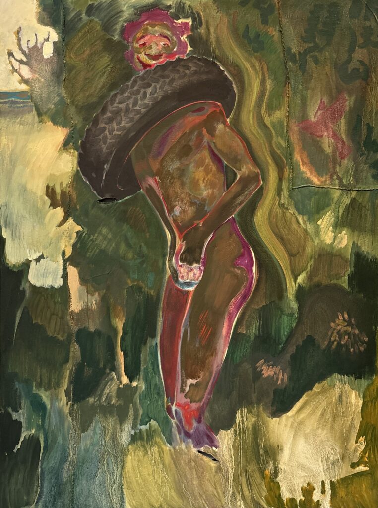
And then there is the man with a mouth painted red like a clown’s, eyes half-closed and wild, a tyre around his neck. I look around and see I am not the only one staring at him. This is a work you cannot walk away from. I look for the caption. It describes the horror of a lynching the artist witnessed as a child in apartheid South Africa. A tyre soaked in petrol was thrown around the victim and set alight. That is what those reddish flares are.
I know Africa only through novels and art, and I am steeped in that deep-rooted European fascination with the exotic. Armitage knows this, and turns it against me. He does so by using a familiar and seductive painterly language, citing Gauguin, Manet, Goya, and Picasso without reservation. As in the group of nude males against a backdrop of brown tones, where touches of gold on their genitals inevitably draw the eye. These are boys who sell themselves to tourists in Mombasa. A counterpoint to Picasso’s Bathers.
And then the disorderly, chaotic crowd during the 2017 elections. More than festive, it looks like a crowd in a frenzy, mistaking promises for truth. Why do we always deceive ourselves?
In some way, I deceive myself too. I let myself be tricked by Armitage’s skilled painting, swept along by his maddened crowd, the colours that never blare, the choral scenes. But with every caption, the enthusiasm cools.
Every scene refers back to lynchings, poverty, prostitution, violence, drugs, death. At a certain point, I lose faith. I could stop at the canvas and seek no further information. I could remain on the threshold. Instead, I read on.
I move closer to the canvas: there are holes that eat into the brushstrokes, and long raised ridges like scars that give it an organic, tactile quality. This is not linen but Lubugo — a fabric from Ugandan tradition, still linked in some cultures to funeral rites. It is made from the bark stripped from fig trees, then softened, beaten, and worked by hand. The fabric remains imperfect; the brush must negotiate with its grooves and tears. Armitage had found some pieces at a souvenir stall a few years ago. That material became for him the body on which to write the history of contemporary Kenya — a country that British colonialism left with wounds still open.
I find myself wondering whether Armitage, born in 1984, carrying both an African and a European identity, does not bear these impulses within himself.
I think back to the boxer. Perhaps she was inviting me to climb into the ring with her. Perhaps she was telling me to watch out: the blows come unexpected, and below the belt.
Only near the end of the exhibition did I catch my breath. Landscapes built from many thin brushstrokes that give an almost three-dimensional depth. But the relentless captions speak of fragile lands, disputed by men, threatened by war or pollution.
The final work shows a sleeping man. His face splits like a mask and floats in space. It is titled You, Who Are Alive — and it seems to say: I have done my part. Now it is up to you.
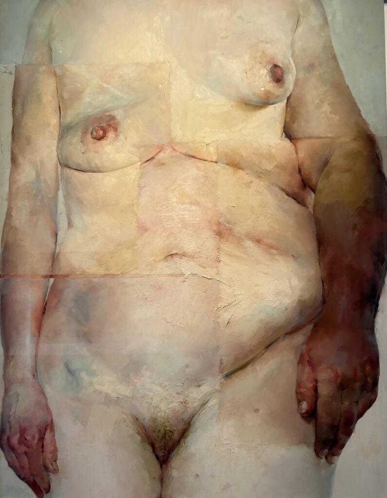
If there’s one thing this exhibition caught me off guard with, it was the scale. In the vast rooms of Ca’ Pesaro I felt out of proportion standing before those three- or four-metre canvases, where the eye had to climb across the nude bodies filling them — overflowing and imperfect.
A woman digs her fingers into the tenderised flesh of disproportionate, powerful thighs; another has one breast soft and drooping, one small and firm; an arm is swollen and diseased. That these may be different bodies, assembled as if in a collage, makes it no less unsettling.
In other works the bodies multiply, intertwine, merge into one another: where does a leg end, where does an arm fall.
Three obese bodies, piled one on top of the other, bound with a cord, seem to be displayed on a counter. The brushstroke is dense, thick — it makes the fleshy masses tremble.
Those fat bodies, vulnerable in their excess, so far from any aesthetic norm, are exposed without defence.
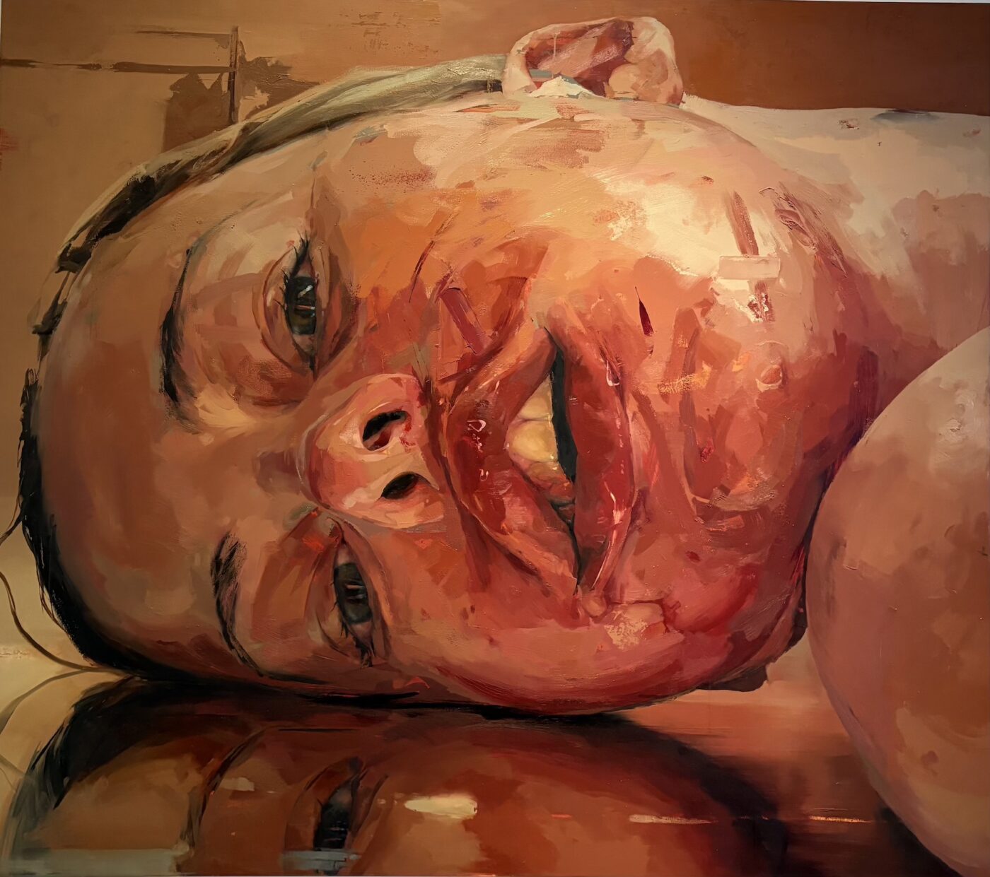
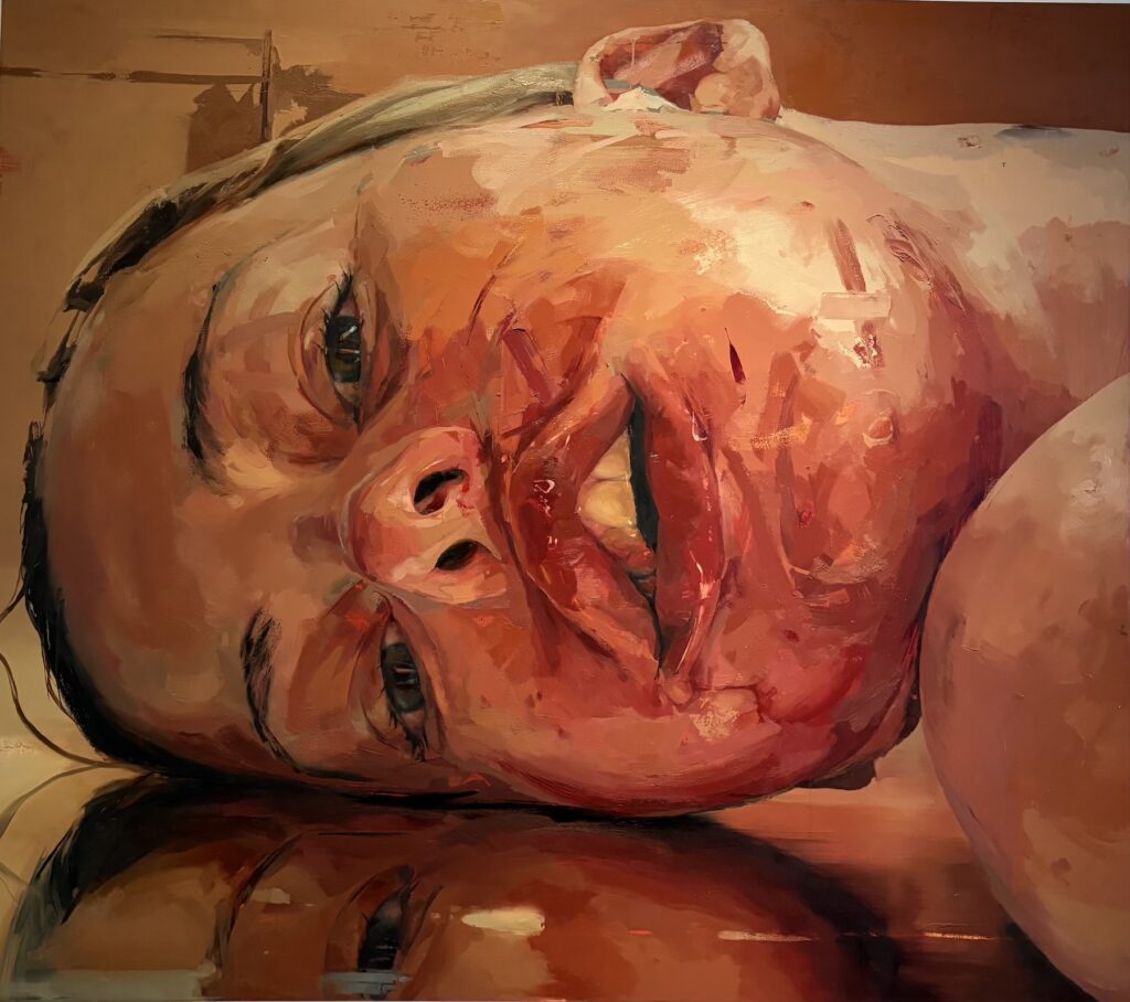
In the portrait rooms, it is always the same face looking back at us: large manga eyes, soft lips — but that beautiful face is brutalised by the paint. Reds and blues bring out swollen lips, bruises on the cheekbones, contusions on the skin. The eyes, reddened by tears, are always slightly wide and uncertain, as though they cannot understand the violence that has struck them.
The paint is sometimes heavy, applied with a palette knife, sometimes scraped or filamentous. Everything hidden beneath the smooth layer of skin seems to press outward: flesh, blood, fascia, fibres, nerves. The surface of the canvas pulses.
That face — so beautiful, so defenceless — looks as though it has been punched.
And yet, even as the emotion threatens to overwhelm you, you sense that Saville is fully inside the process of painting. Not only as an exploration of her medium — the colour, the drips, the scratches, the marks — but by portraying herself. Saville is at once model, maker, and spectator.
It is not self-examination that interests her, the artist says, but using her own face and body — photographed and enlarged — as an instrument to probe something deeper. “Beauty frightens me,” she confesses; she fears her work might “not be serious” or might seem “sentimental.”
The dialogue with the great masters of the past is explicit and conscious: Cy Twombly, Lucien Freud, Kokoschka. If I had to choose one, I would choose Kokoschka, for the charged and nervous palette.
In the room of the Pietàs, bodies are abandoned in a last embrace. The colour recedes — except for a large Madonna on a gold ground, a homage to Byzantine and Venetian painting.
Venice — a city she returns to often — is present in her work also through the Venetian masters she studies and reworks.
The final two works are a tribute to Titian. Venus and Adonis gives her the occasion to return to intertwined bodies; in the background, this time, she adds the mountains of the Cadore. Of the Danaë — the nymph possessed by Jupiter in a shower of golden rain — little remains of that idealised beauty. A plump woman approaching middle age, with red hair, looks out at the viewer: perhaps tired, perhaps indifferent to her own exposure.
In the Arsenale, on the first floor of the Sale d’Armi, the Republic of South Africa’s pavilion will remain empty this year. The Russian Federation’s pavilion, closed since 2022, might on the other hand reopen — although the latest news seems to cast doubt on this possibility. The pavilion’s commissioner, Anastasia Karneeva, through her company Smart Art, submitted a formal request to participate, and the Biennale accepted the project.
All hell broke loose. Twenty-two European countries protested vehemently against the Russian presence, and the European Commission threatened to cut the Biennale’s funding. This happened just days after the Paralympics, where Russian athletes not only competed but won gold medals and stood on the podium to the sound of their national anthem.
Giovanni Bellini, Presentazione di Gesù al Tempio, 1460-64, Pinacoteca Querini Stampalia
It is not just crimson, purple, or scarlet. Venetian red is something more: it is indefinable. Layered hues, transparent lacquers, and warm, enveloping sensuality evoke the shifting glow of a candle flame, making surfaces vibrate with every play of light.
In the sacred themes of the Venetian Renaissance, red recalls the blood of sacrifice, martyrdom, and divine love—moments central to Christian tradition. In portraits and secular themes, however, it breaks free from symbolic meanings, expressing elegance, sensuality, and passion.
Red is a dramatic color that irresistibly attracts the viewer’s gaze, taking center stage. When worn, it commands attention, as if the wearer were performing under the spotlight: red must be worn with confidence.
Perhaps for this reason, it has always been a regal color, and in the collective memory of Renaissance Venice, the purple of Byzantine emperors was still vivid.
The noblest expression of red was visible everywhere: in the ancient mosaics of Saint Mark’s Basilica, in medieval altarpieces, and in the robes of senators. Reserved for solemn contexts and prestigious figures, by the 16th century it had also become prominent in private or allegorical portraits.
For the portrait of Laura, Giorgione applied delicate glazes ranging from red to the brown of fur, shaping the figure with a soft and natural light. The exposed breast, the fur edge brushing against the nipple, creates a strong charge of sensuality.
As in other enigmatic works by the artist, the identity of the figure remains unresolved: perhaps Flora, perhaps a courtesan, a nymph, or—as suggested by the laurel wreath—Laura, beloved of Petrarch. More likely, it is an auspicious portrait commissioned for a wedding.
The precious pigment was primarily obtained from cinnabar, a rare mineral containing mercury sulfide. Due to its cost, from the 13th century onwards, a chemical process using a mixture of mercury and sulfur—already known in China and the Islamic world—produced a similar pigment: vermilion. Easier to obtain and of more consistent quality than natural cinnabar, vermilion was widely used. Both pigments, thanks to their intensity and covering power, were employed in rendering drapery and fabrics.
These were often overlaid with transparent organic red lacquers, such as madder root lacquer, which gave red-orange and pink tones. Until the early 16th century, artists also used kermes, a red derived from an insect related to the ladybug, known since prehistoric times. Around 1520, cochineal—a new insect of the same family—arrived from Mexico on European markets, producing a lacquer of brighter color. With its transparency and intensity, cochineal quickly became popular among Venetian and Italian artists in general, who replaced kermes with this lacquer for brighter glazes.
Titian, Flora, 1515, Gallerie degli Uffizi, Florence
In Flora, Titian reached exceptional virtuosity in his use of red. While seemingly less prominent than in other portraits, delicate shades of pink-red and orange permeate the entire painting: from the young woman’s auburn hair to her flushed complexion, to the luminous highlights on the velvet mantle softly wrapping her. The moonlit sheen of her blouse accentuates her rosy skin and the folds of the velvet. Like Giorgione’s Laura, this young woman is likely an allegory; the roses she holds suggest Venus, the goddess of love, but she is generally identified as Flora.
In stark contrast to Flora’s sensuality is the portrait of Isabella of Portugal, painted by Titian more than thirty years later. It was a posthumous portrait of Charles V’s beloved wife, who died at 35, perhaps of exhaustion, after giving birth to their seventh child.
Titian, Isabella of Portugal, 1548, Museo Nacional del Prado, Madrid
Charles V’s request was less about remembering his wife’s true features and more about reaffirming her role as empress of the vast Habsburg empire beside him—a desire Titian fully understood. Gold, jewels, her hairstyle, and the play of light on the velvet of her garments and the curtain all convey the essence of royalty and Christian virtue.
The prayer book is open, and her gaze is lifted toward a point far beyond the viewer. Isabella no longer seems part of this world. Remote, like an icon, she appears to belong instead to the azure sky above the Dolomites that open behind her—a signature touch of Titian, who often referenced the land of his birth in his works.
The bodice is dominated by a deep red, likely created with cinnabar and cochineal lacquer glazes to intensify the tones and confer depth.
But red was no longer exclusive to queens and empresses, goddesses of love, or courtesans: noblewomen now favored this evocative and impactful color as well.
Paris Bordone, Portrait, 1550, Galleria Palatina, Florence
In Paris Bordone’s Female Portrait—he was a student and collaborator of Titian—the red of the dress imbues the unidentified subject with energy and an imposing presence. In the 19th century, critics believed her to be a Medici wet nurse, but the luxurious fabric, pearl necklace, and her bearing suggest a high social rank. The shimmering reflections on the velvet are achieved with lighter brushstrokes, simulating the play of light on the fabric.
A warmer, softer light illuminates her face, whose expression hints at a resolute character, as does her pose, with arms free rather than traditionally folded in her lap.
By the mid-century, Veronese brought greater freedom to the Venetian school, moving beyond the warm tones that had dominated from medieval altarpieces through the Renaissance heights of Bellini, Giorgione, Sebastiano del Piombo, and Titian, to name a few.
Paolo Veronese, Portrait, 1555, Musee de la Chartreuse, Douai, France
In this lady’s portrait—dated to 1565—while the velvet red remains saturated and dense, with some brighter highlights, the cool glazes of her blouse create a more ethereal effect and a complex interplay of colors. Her skin, though still tinged with pink according to Renaissance beauty standards, reveals cooler shadows achieved by blending light tones with touches of blue and gray.
The techniques of color experimentation, layering, and combining cinnabar, vermilion, and red lacquers would reach their peak in the 17th century in the Netherlands, with artists like Van Dyck and Rembrandt, aided by the advent of a new red: carmine cochineal, offering even more brilliant effects.
Venice had anticipated a trend that would span centuries, cementing its central role in art history. Red, with its infinite shades and symbolic power, remains one of the most evocative marks of this extraordinary artistic era, capable of achieving regal and sensual effects that continue to captivate art lovers today.
La Bella, Portrait by Titian, 1530s, Portland Art Museum. Model unknown.
Imagine a young woman, beautiful and self-assured: some might call her audacious.
She must have been enchanting when singing or playing the viola da gamba, often alongside her sister Cassandra, in their maternal home in San Trovaso, a lively gathering place for musicians and writers. Many offer her their verses, some even propose marriage. But Gaspara cherishes her freedom—both amorous and intellectual—and delights in composing sonnets, which she recites in the refined salons of Venetian society.
Born in Padua around 1523, Stampa moved to Venice with her mother and siblings after her father’s death. Well-integrated into the city’s cultured circles, she was admired for her poetic and musical talents. Both her mother and brother allowed her to freely express her artistic vivacity, a condition that set her apart from her contemporaries.
Gaspara was often overwhelmed by love. At the home of the noble Domenico Venier, she met Collaltino di Collalto, an aristocrat from Treviso, who combined a career in arms with a passion for poetry. She fell for him at first sight, entrusting the turmoil of that fatal encounter to her verses: “What wonder it was that at the first assault, young and alone, I was caught in the snare,” she writes in one of the sonnets dedicated to him.
It was an all-consuming love, supported by their shared passion for poetry. However, Collaltino, though fascinated by Gaspara, did not fully return her feelings. Preoccupied with his Treviso estate and his relationship with Henry II of France, whom he served as a man of arms, he was often absent from Venice.
Gaspara was consumed by torment, and the knowledge that other men loved her brought no solace. “He flees from me; I pursue him; others pine for me.” In three stark phrases, Stampa captures the paradox of loves that chase each other without ever meeting, a whirlwind of desire and disappointment that becomes all the more bitter.
With the same disillusionment, she acknowledges the weakness of Collaltino’s affection: “I am so weary of waiting (…) and he lives happily on his hills.” When Collaltino, after three years of an unstable relationship, left her for good, Gaspara was devastated: “From then on, I have trembled and sweated, wept, despaired, and desired.”
Yet, unexpectedly, after some time, Gaspara fell in love again: “I feel a fire equal to the first,” she writes in one of the fourteen sonnets dedicated to Bartolomeo Zen, her last and more stable, more fulfilling love.
With renewed enthusiasm, the poet confesses in one of her most famous sonnets that love is for her a condition of life: a fire that nourishes and regenerates her, like the salamander with which she identifies:
Love has made me such that I live in fire,
like a new salamander in the world, and like
that other no less strange creature,
that lives and breathes in the same place. All my delights and my joy,
are to live burning and not feel pain,
to not care whether he who causes this
has pity on me little or much. Hardly had the first flame been extinguished,
than Love lit another, which, as I feel,
is even more alive and greater than before. And I do not regret burning in love,
so long as he who has newly won my heart
remains satisfied and content with my fire.
Gaspara Stampa died of fever at just 31 years old, in 1554. That same year, her sister Cassandra oversaw the publication of Rime, over three hundred Petrarchan sonnets in which the poet poured out her feelings with great immediacy.
Yet, after her death, her poetry fell into oblivion.
Only with the 1738 edition, curated by a descendant of Collaltino, were the Rime rediscovered and recognized as a masterpiece of Renaissance female poetry. Despite 19th- and early 20th-century criticism, which found Gaspara’s candor shocking and considered her bold style fitting only for a courtesan, today, Stampa’s dignity as a cultured and free woman has been restored. Her writing is celebrated for its intellectual vitality, as it legitimizes feelings such as passion and desire for women, helping to redefine the female role in Renaissance literature.
Anna Maria Maiolino, Entrevidas, 1981/2000. Maiolino, together with Nil Yalter, have been awarded the Golden Lion for lifetime achievement to the Art Biennale 2024.
The Venice Biennale is more than just an exhibition – it’s an immersive art experience. Held every two years, this event transforms Venice into a dynamic canvas of creativity.
The Venues: Giardini and Arsenale The Biennale is hosted in two historic locations – the Giardini and the Arsenale. The Giardini is a picturesque park dotted with distinctive pavilions, each representing different countries. These pavilions, transformed and renewed over the years, reflect the changing artistic visions and politics of their respective nations.
Each national pavilion showcases artists selected through diverse methods, either by cultural ministries or expert committees. The main show, organized by the Biennale Foundation, is housed in the central pavilion, curated by renowned figures like Adriano Pedrosa this year.
Strolling through the Biennale, you encounter an astonishing variety of art – from installations and classical pieces to art-videos and live performances. Each pavilion is a gateway to a unique artistic realm.
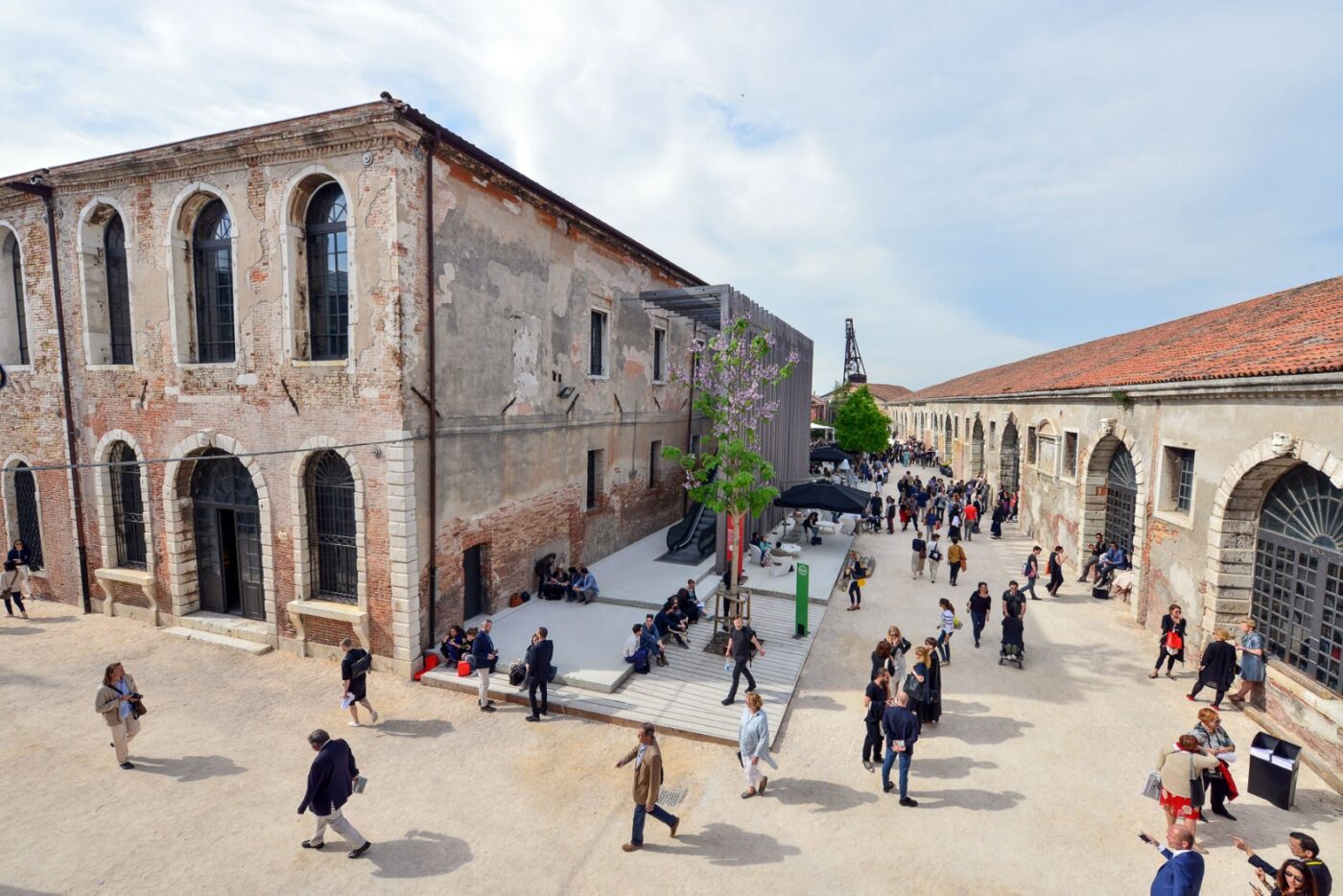
The Arsenale, the former shipyard of the Venice Republic, consists of a series of sheds of the 16th century. The longest of them, the Corderie (rope-factory) is now a space where artworks are displayed without interruption or organized in mini pavilions.
Other sheds, once used as docks for shipbuilding, are now transformed into pavilions assigned to different countries for their national exhibits.
As you walk through the venue, you are immersed in an environment that resonates with centuries of maritime history.
Visiting Tips To fully embrace the Biennale spirit, consider spreading your visit over two days. Start with the Giardini, allowing time to relax at the cafeterias or on a bench under the trees. Dedicate another day to the Arsenale for a complete experience.
Beyond the Traditional Venues With increasing participation, the Biennale spills over into Venice’s churches, palaces, and other spaces, turning the city into a vibrant open-air gallery that offers a contemporary snapshot of global art.
A visit to the Biennale is an exploration of the ever-evolving landscape of art in today’s world.
This website uses functional cookies only.
Diese Website verwendet nur funktionale Cookies.
Questo sito utilizza solo cookie funzionali.
Functional
Always active
The technical storage or access is strictly necessary for the legitimate purpose of enabling the use of a specific service explicitly requested by the subscriber or user, or for the sole purpose of carrying out the transmission of a communication over an electronic communications network.
Preferences
The technical storage or access is necessary for the legitimate purpose of storing preferences that are not requested by the subscriber or user.
Statistics
The technical storage or access that is used exclusively for statistical purposes.The technical storage or access that is used exclusively for anonymous statistical purposes. Without a subpoena, voluntary compliance on the part of your Internet Service Provider, or additional records from a third party, information stored or retrieved for this purpose alone cannot usually be used to identify you.
Marketing
The technical storage or access is required to create user profiles to send advertising, or to track the user on a website or across several websites for similar marketing purposes.